Scaling design with the
Spark Sport design system


Lead product designer
8 months
Mobile, desktop & TV
4+ person cross-functional team
MY ROLE
Leading the design and research efforts to define key components and patterns for the system,
Conducted component audits to ensure consistency across platforms and improve usability.,
Designed reusable components and ensured smooth handover between design and development,
Collaborated with developers to ensure design tokens were correctly implemented, enabling consistent styling across all platforms.
PROJECT OVERVIEW
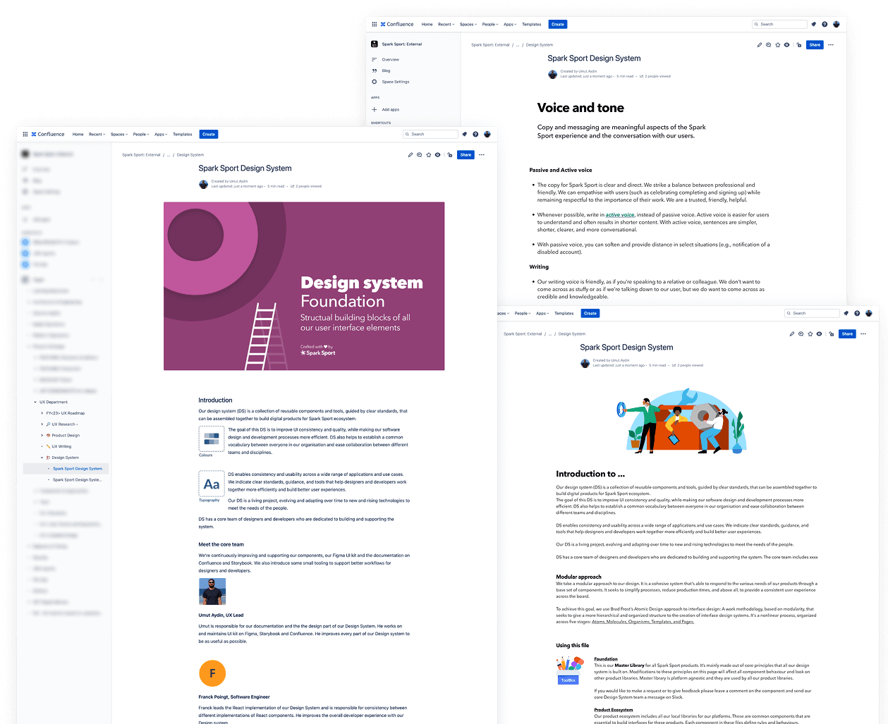
The Spark Sport Design System was created to provide a unified set of guidelines, components, and patterns for consistent and efficient design across multiple platforms. The system aimed to streamline the design process, reduce redundancy, and ensure a seamless experience for users accessing Spark Sport content.
Scaling design with the
Spark Sport design system


Lead product designer
8 months
Mobile, desktop & TV
4+ person cross-functional team
MY ROLE
Leading the design and research efforts to define key components and patterns for the system,
Conducted component audits to ensure consistency across platforms and improve usability.,
Designed reusable components and ensured smooth handover between design and development,
Collaborated with developers to ensure design tokens were correctly implemented, enabling consistent styling across all platforms.
PROJECT OVERVIEW
The Spark Sport Design System was created to provide a unified set of guidelines, components, and patterns for consistent and efficient design across multiple platforms.
The system aimed to streamline the design process, reduce redundancy, and ensure a seamless experience for users accessing Spark Sport content.
THE PROBLEM
How might we build a design system to improve consistency?
How might we build a design system to improve consistency?
Establishing a unified, token-based design system to drive consistency, reduce development rework, and accelerate feature delivery across Spark Sport’s web, mobile, and TV platforms.
Establishing a unified, token-based design system to drive consistency, reduce development rework, and accelerate feature delivery across Spark Sport’s web, mobile, and TV platforms.
CURRENT CHALLENGES
Inconsistent UI
Visual and interaction patterns vary across platforms, reducing user confidence.
Delivery delays
Lack of reusable components slows down the design and dev process.
Repeated work
Teams often duplicate effort due to missing shared foundations.
Quality gaps
Inconsistent standards lead to fragmented experiences and lower polish.
THE RESEARCH
Strategic groundwork for
a scalable system
Strategic groundwork for
a scalable system
I began with a structured approach to make sure the system was effective, scalable and valuable for all users.
I began with a structured approach to make sure the system was effective, scalable and valuable for all users.
STRATEGY & ROADMAP
Key player & goals
Identify key users designers, engineers and product managers who would interact with the system.
Research
Gather user insights and assess pain points to uncover opportunities that will inform the design system’s development.
Understand needs
Focus on essential design elements like colours, typography and tone, working closely with each team to address their challenges.
Audit & inventory
Evaluate the current state of the system. Document all existing assets and UI elements, ensuring nothing is overlooked in the inventory process.
Foundations
Develop a platform-agnostic and tokinesed framework that accounts for all UI elements across multiple platforms and brands.
Evolve & maintain
The design system should be a living project, continuously evolving to adapt to new technologies and user needs.
THE DESIGN
Building a tokenised design system
Building a tokenised
design system
We used design tokens to define colours, typography, spacing, ensuring consistency across platforms. Tokens replaced hardcoded values and made updates easier for both designers and developers.
We used design tokens to define colours, typography, spacing, ensuring consistency across platforms. Tokens replaced hardcoded values and made updates easier for both designers and developers.

PLATFORM AGNOSTIC TOKENS
To ensure consistency, I created a neutral, platform-agnostic set of tokens defined at the foundation level, not tied to any product or brand.
Instead of naming colors by use, I used role and tone, separating core values from UI specifics.
This approach made the system scalable across web, mobile and TV, allowing flexible mapping to product-specific components while keeping consistency.


SELF-DOCUMENTING COMPONENTS
I designed components that automatically provide relevant documentation about their usage, variations and best practices, directly within Figma & codebase

COMPONENT TOKENS
After defining foundational tokens, I created component-level tokens to support specific UI elements like buttons, inputs, and cards.
Each component had variants and states, using semantic naming Button/Primary/Large/Pressed or input-border-error.
This made the system easier to understand and maintain, allowing designers and developers to work with predictable, reusable values across platforms.

GRID SYSTEM
I defined a responsive grid system that could scale across mobile, tablet and web. It was built on a 12-column layout with consistent spacing, margins, and gutters. The grid was flexible to support different breakpoints and content types, and aligned with the layouts.
DESIGN PRINCIPLES
I developed core design principles to guide decision-making across teams. I started by reviewing Spark Sport’s brand values and product goals, then collaborated with designers, developers, and product managers to align on shared values.

GOVERNANCE & DOCUMENTATION
I established clear guidelines to manage the design system’s evolution, ensuring that all updates are meaningful and aligned with the overall vision. This included:
- Roles and responsibilities: Defining who is responsible for maintaining, updating and reviewing the system, between designers, developers, and product managers.
- Version control: Setting a system for versioning the design tokens, components and other assets to ensure that updates are properly tracked and old versions are still accessible if needed.
- Approval processes: Creating a process for approving new components, patterns, or tokens, so that any additions maintain design consistency and quality standards.
THE COMPONENTS
Designing a unified set of
reusable components
Designing a unified set of
reusable components
I designed a scalable library of components to ensure visual and functional consistency across Spark Sport’s platforms.
Each component is flexible, accessible and built for real-world use, supporting faster development.
I designed a scalable library of components to ensure visual and functional consistency across Spark Sport’s platforms. Each component is flexible, accessible and built for real-world use, supporting faster development.
SOME KEY COMPONENTS
Button
With options for size, variant, icon placement and accessibility
Dropdown
Supporting multiple content types and expand/collapse states
Text input
With validation, helper text and label positioning options
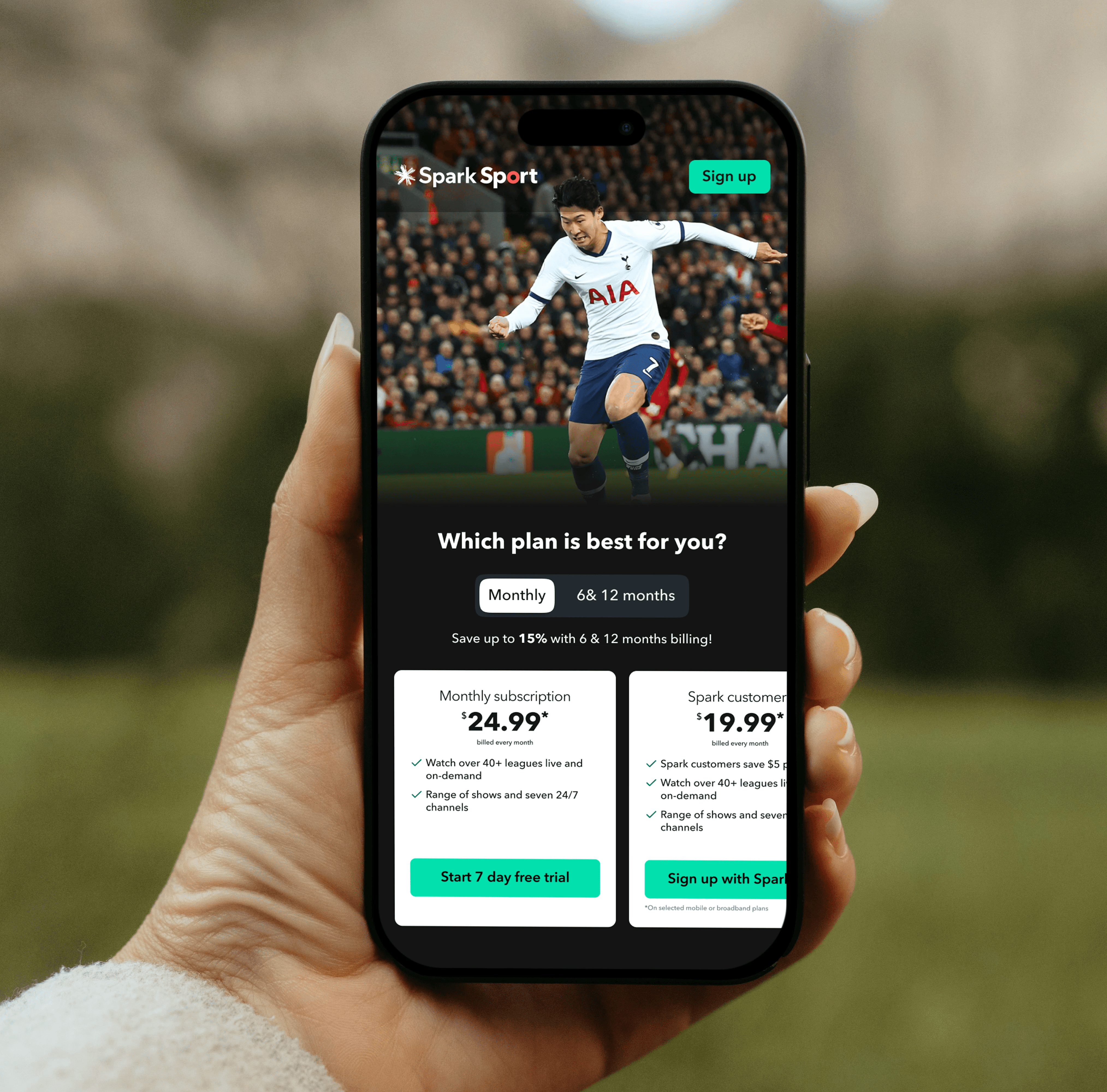
Pricing cards
Compare subscription options with clear pricing and features
Content card
Display game info, team logos & quick actions in a compact layout
Bottom navigation
With support for active states, icons & customisable navigation
Button
With options for size, variant, icon placement and accessibility
Pricing cards
Compare subscription options with clear pricing and features
Dropdown
Supporting multiple content types and expand/collapse states
Content card
Display game info, team logos & quick actions in a compact layout
Text input
With validation, helper text and label positioning options
Bottom navigation
With support for active states, icons & customisable navigation
THE IMPACT
Scaling design impact across Spark Sport
Scaling design impact across Spark Sport
We created a unified system to streamline Spark Sport’s digital experience, boosting consistency, speeding up delivery and improving team collaboration.
We created a unified system to streamline Spark Sport’s digital experience, boosting consistency, speeding up delivery and improving team collaboration.
KEY METRICS
40%
Reduction in design and development rework
90+
Reusable components built for cross-platform use
28%
Faster delivery cycles across squads
50%
Faster onboarding for new designers
Explore other projects

Scaling design with the Spark Sport design system
Senior product designer
6 months
Mobile app
10+ person cross-functional team
MY ROLE
Leading the design and research efforts to define key components and patterns for the system,
Conducted component audits to ensure consistency across platforms and improve usability.,
Designed reusable components and ensured smooth handover between design and development,
Collaborated with developers to ensure design tokens were correctly implemented, enabling consistent styling across all platforms.
PROJECT OVERVIEW
The Spark Sport Design System was created to provide a unified set of guidelines, components, and patterns for consistent and efficient design across multiple platforms. The system aimed to streamline the design process, reduce redundancy, and ensure a seamless experience for users accessing Spark Sport content.
THE PROBLEM
How might we build a design system to improve consistency?
Establishing a unified, token-based design system to drive consistency, reduce development rework, and accelerate feature delivery across Spark Sport’s web, mobile, and TV platforms.
CURRENT CHALLENGES
Inconsistent UI
Visual and interaction patterns vary across platforms, reducing user confidence.
Delivery delays
Lack of reusable components slows down the design and dev process.
Repeated work
Teams often duplicate effort due to missing shared foundations.
Quality gaps
Inconsistent standards lead to fragmented experiences and lower polish.
THE DESIGN
Building a tokenised design system
We used design tokens to define colours, typography, spacing, ensuring consistency across platforms. Tokens replaced hardcoded values and made updates easier for both designers and developers.
PLATFORM AGNOSTIC TOKENS
To ensure consistency, I created a neutral, platform-agnostic set of tokens defined at the foundation level, not tied to any product or brand.
Instead of naming colors by use, I used role and tone, separating core values from UI specifics.
This approach made the system scalable across web, mobile and TV, allowing flexible mapping to product-specific components while keeping consistency.
SELF-DOCUMENTING COMPONENTS
I designed components that automatically provide relevant documentation about their usage, variations and best practices, directly within Figma & codebase
COMPONENT TOKENS
After defining foundational tokens, I created component-level tokens to support specific UI elements like buttons, inputs, and cards.
Each component had variants and states, using semantic naming Button/Primary/Large/Pressed or input-border-error.
This made the system easier to understand and maintain, allowing designers and developers to work with predictable, reusable values across platforms.
GRID SYSTEM
I defined a responsive grid system that could scale across mobile, tablet and web. It was built on a 12-column layout with consistent spacing, margins, and gutters. The grid was flexible to support different breakpoints and content types, and aligned with the layouts.
DESIGN PRINCIPLES
I developed core design principles to guide decision-making across teams. I started by reviewing Spark Sport’s brand values and product goals, then collaborated with designers, developers, and product managers to align on shared values.
DOCUMENTATION
I established clear guidelines to manage the design system’s evolution, ensuring that all updates are meaningful and aligned with the overall vision. This included:
- Roles and responsibilities: Defining who is responsible for maintaining, updating and reviewing the system, between designers, developers, and product managers.
- Version control: Setting a system for versioning the design tokens, components and other assets to ensure that updates are properly tracked and old versions are still accessible if needed.
- Approval processes: Creating a process for approving new components, patterns, or tokens, so that any additions maintain design consistency and quality standards.
THE COMPONENTS
Designing a unified set of reusable components
I designed a scalable library of components to ensure visual and functional consistency across Spark Sport’s platforms. Each component is flexible, accessible and built for real-world use, supporting faster development.
SOME KEY COMPONENTS
Button
With options for size, variant, icon placement and accessibility
Pricing cards
Compare subscription options with clear pricing and features
Dropdown
Supporting multiple content types and expand/collapse states
Content card
Display game info, team logos & quick actions in a compact layout
Bottom navigation
With support for active states, icons & customisable navigation
Text input
With validation, helper text and label positioning options
THE IMPACT
Scaling design impact across Spark Sport
We created a unified system to streamline Spark Sport’s digital experience, boosting consistency, speeding up delivery and improving team collaboration.
40%
Reduction in design and development rework
90+
Reusable components built for cross-platform use
28%
Faster delivery cycles across squads
50%
Faster onboarding for new designers
KEY METRICS